Autumn Colour Matching
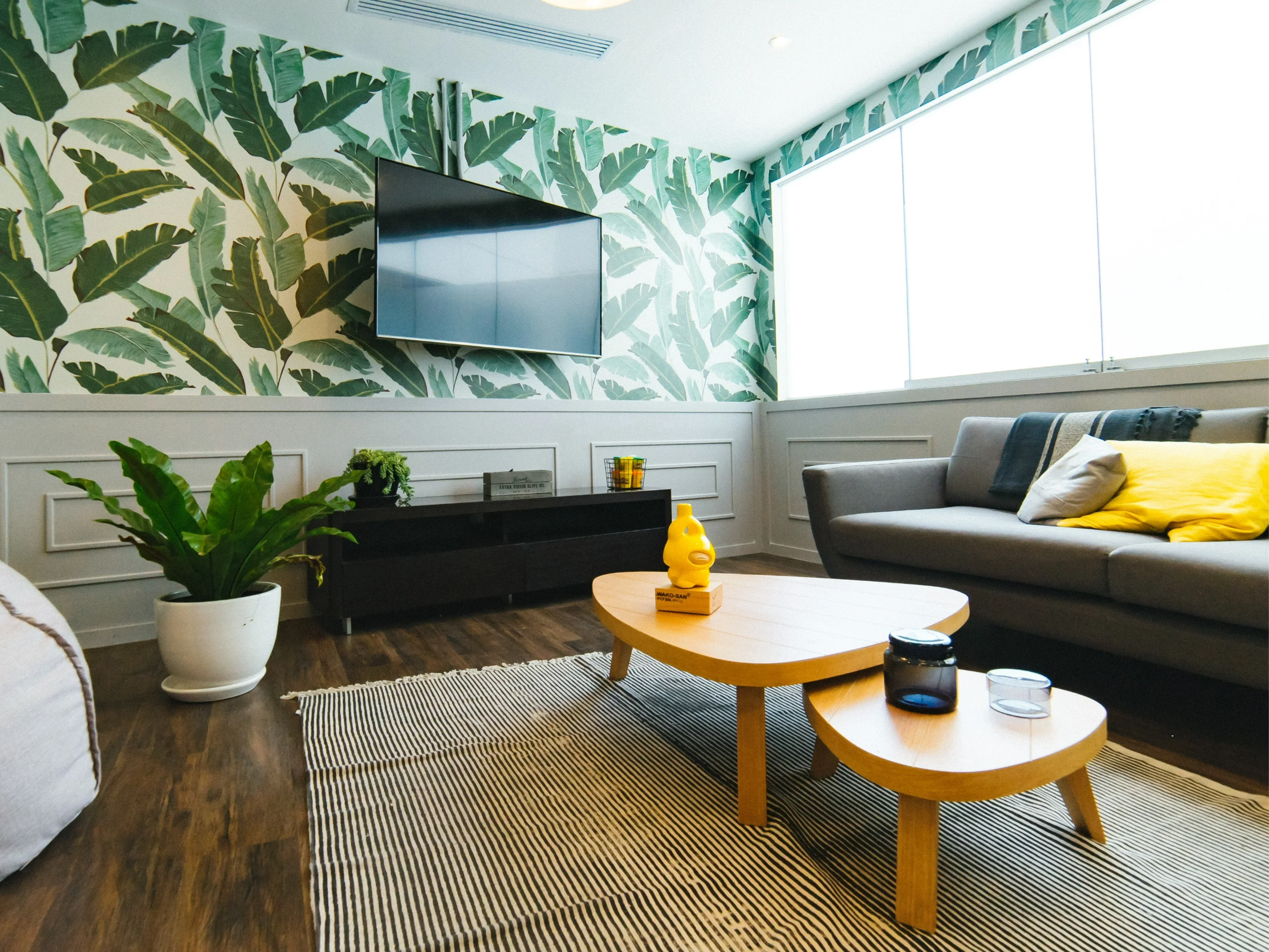
Matching and theming a room to a colour you are fond of can be difficult. As autumn approaches, you may be starting to think of a switch from some summer furnishings and colours at home or work to a more rustic feel, with dark yet warmer shades filtering into your tones. You may choose to stick to neutrals for most of the furnishings, but add vibrancy to the space with art. Whether you're looking to create a feature wall or painted accents, or want to add colour with furniture, accessories and textiles the colours need to sit well together.
A good starting point is to work within a selected spectrum of colour tones when deciding your furnishings or wall paint. If available, colour charts often make seeing a potential relationship between differ colourshades simpler, as tones and shades arranged in similar vertical lines will always complement each other. If not, searching for inspiration online on platforms such as Pinterest, Tumblr and Instagram can help you discover rooms and interiors that are similar to your ideas, using combinations of colours and shades that you like with the opportunity to see how they look as a finished article in high resolution format. You can then look through the discussion on these posts and usually can find valuable tips from the community that may apply directly to you. This will help you get a sense for what you like so you can really put your autumn ideas into motion.
Consider which colours you are using together, but also how much of each. This is often decided by the layout and proportions of a room, as well as the natural light that pours through its windows. Using two colours in equal measure can be surprisingly effective, but normally you will achieve a sense of balance by using more of one colour and less of another; a grey tinge with an accent of yellow or saturated orange, for example. The Posh Trading Stormy Sky Grey Matbox set can sit subtly on the table space in the room, with the elegant and slick finish complimenting a smoother ambient wall shade or even surrounding art, with colours discussed previously such as yellow or orange. Consider the size and shape of your room and how much light it gets during the day. Deeper colours tend to suit cosier rooms such as the study and living room, or bigger rooms with lots of light, but strong colours can be used in smaller amounts to bring depth and a focal point to any room.
Changing the colour of a room can have a hugely positive effect on how the space looks and feels. It can be a refreshing task that rejuvenates your home for the winter months, whether you are destined for cosy nights in or hosting dinner events and family meals. From furnishings to floors and walls, making sure each praises the other will give you an end product to be proud of.
